Upex Ortho
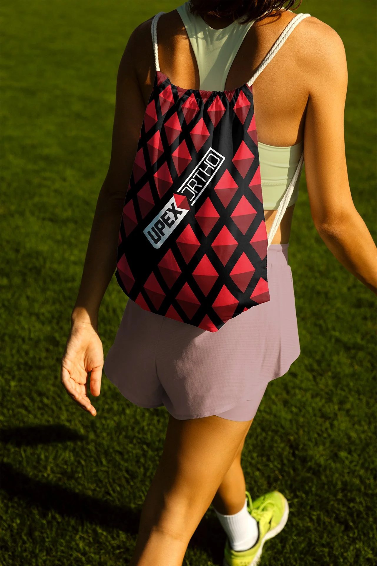
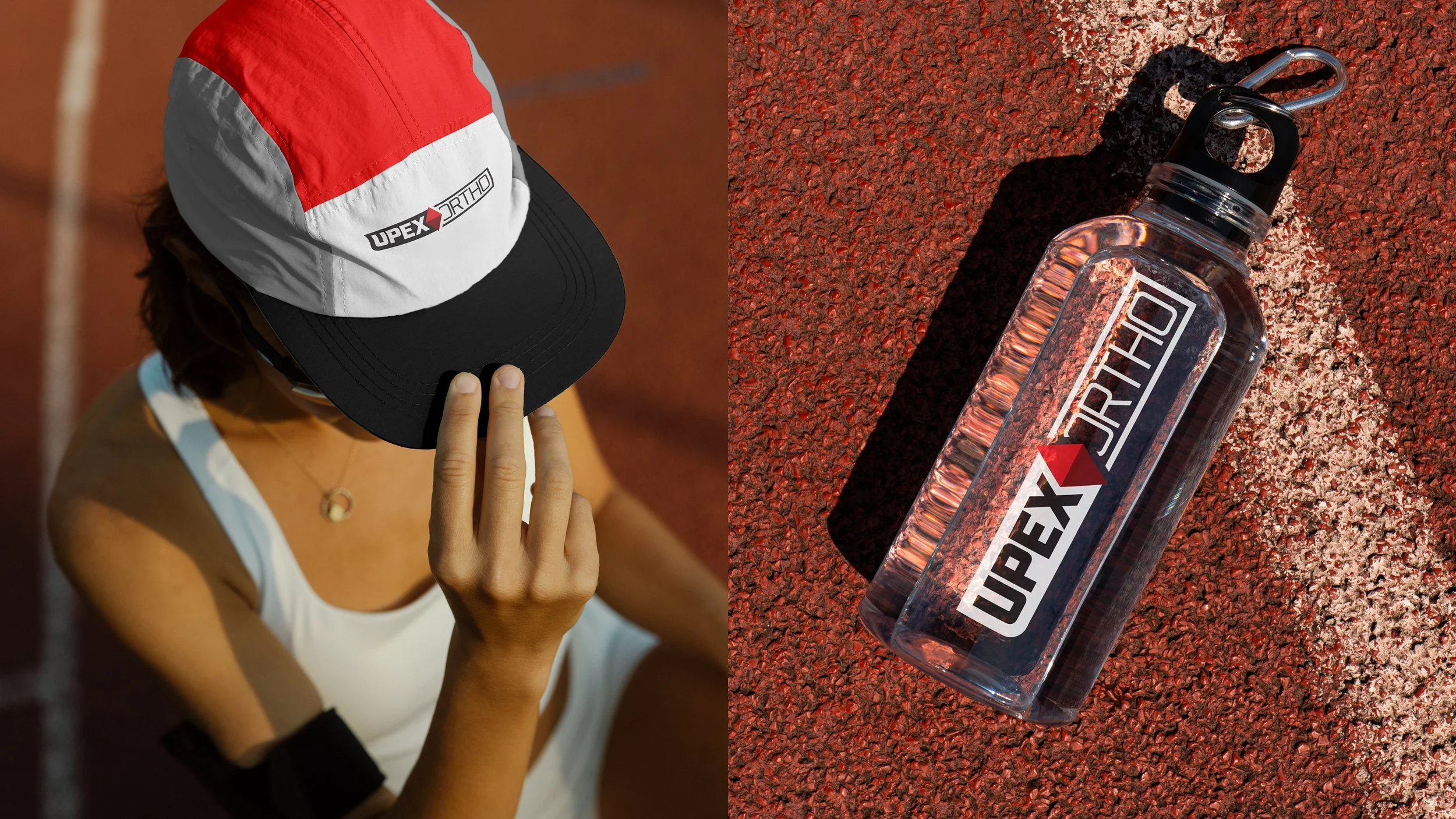
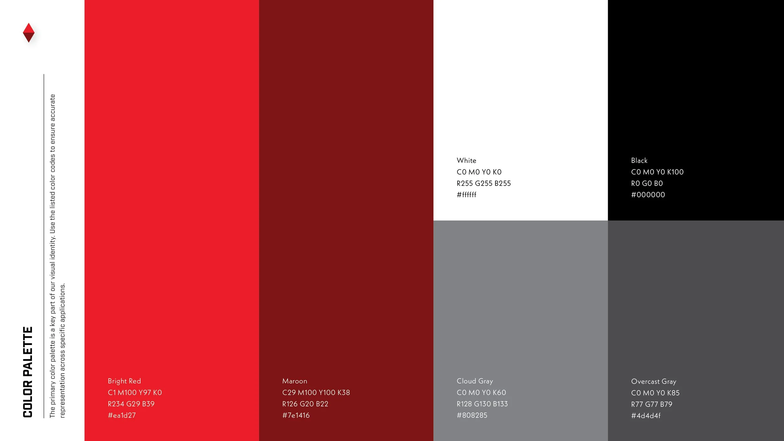
Upex Ortho’s visual system was shaped by the discipline and precision inherent to orthopedics. The identity draws on structured geometry, sharp lines, and refined balance to convey both trust and strength. Just as the industry requires both resilience and innovation, the design language combines a stoic, bold palette with clean forms and timeless typography. The result is a look that is immediate, confident, and enduring, establishing an identity positioned to become a modern classic within the orthopedic space.
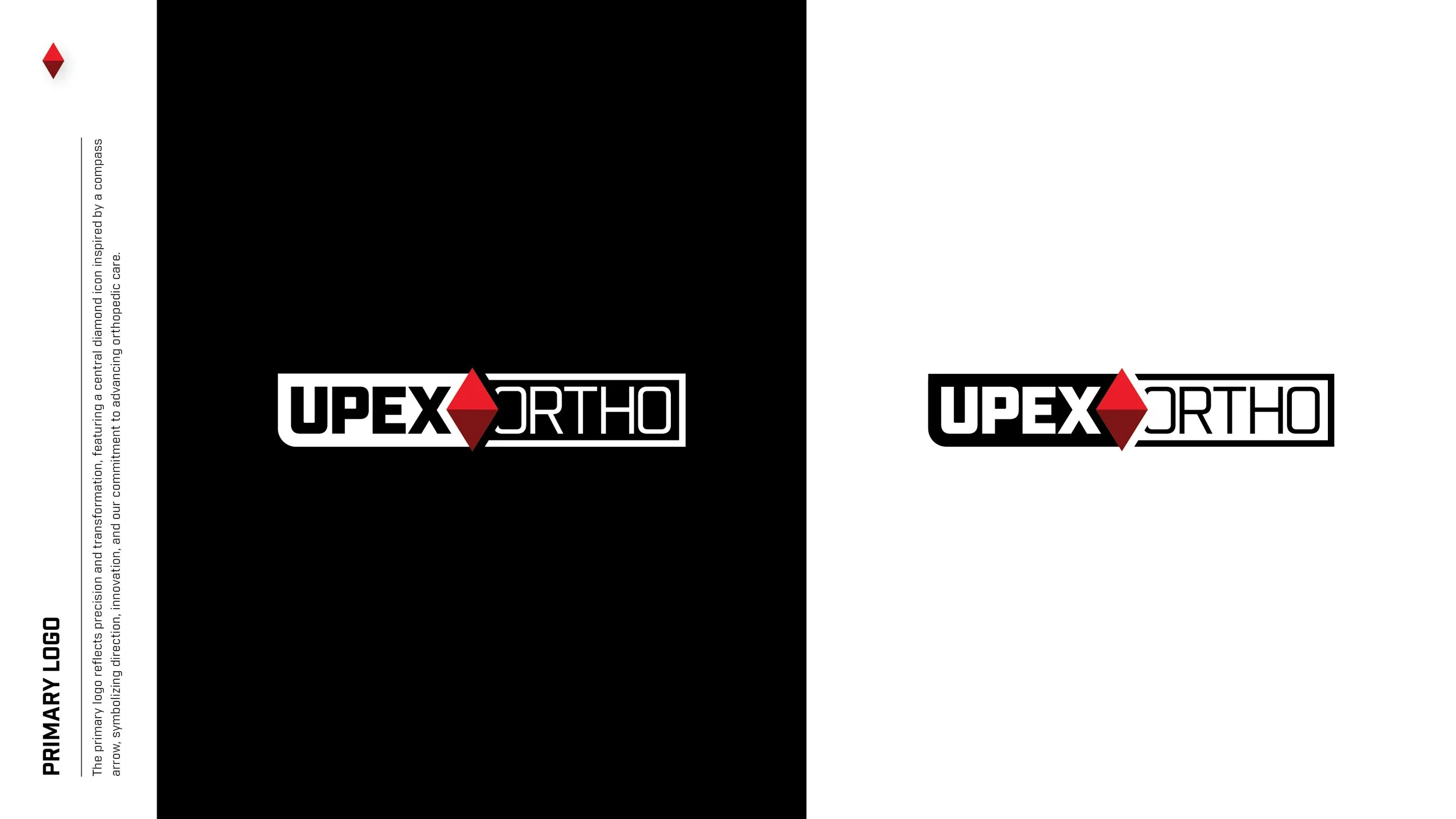
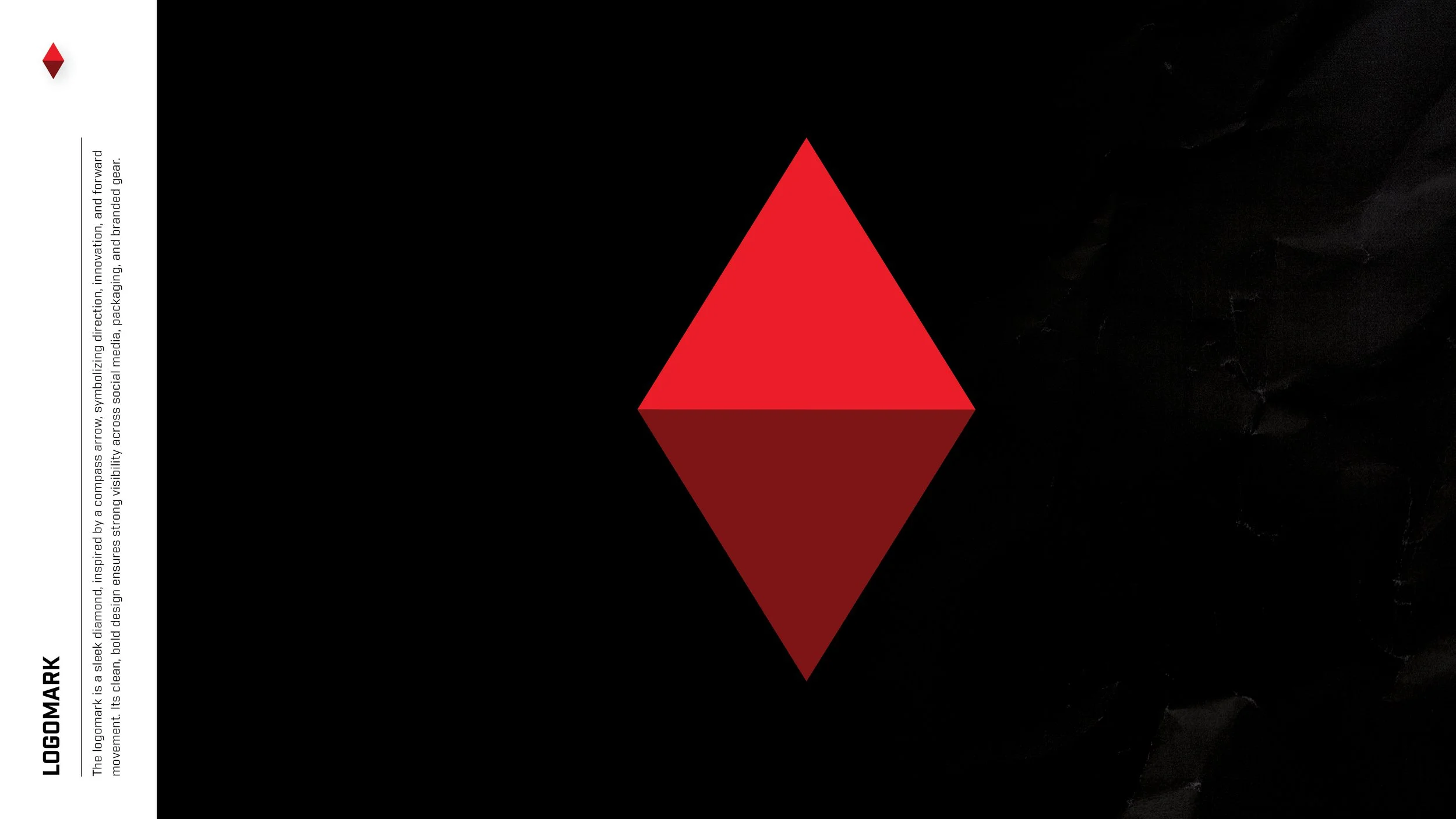
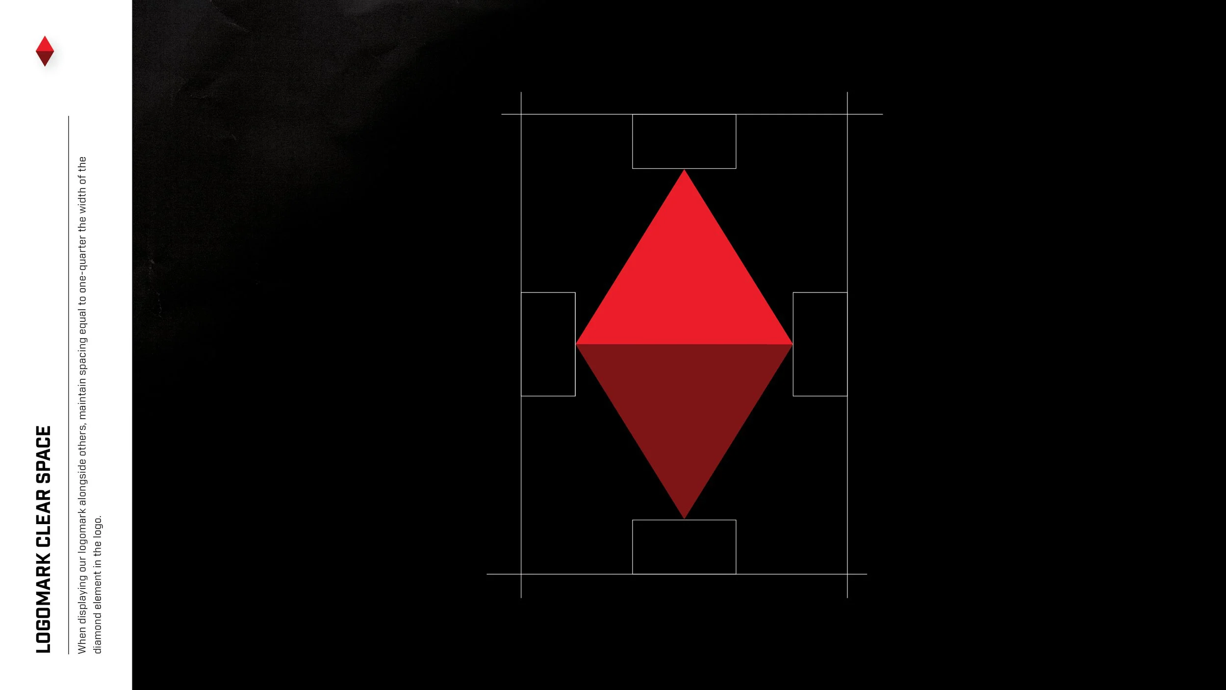
The graphics and imagery were guided by the compass rose, a symbol of orientation and discovery that anchors the Upex Ortho identity. Its radiating symmetry evokes both precision and possibility, suggesting a journey toward clarity, trust, and advancement within the orthopedic landscape.